Pleco for Android 3.2.3 Beta 1

mikelove

皇帝
Staff member
A pretty big update with a minor version number because we're trying to keep the x.x releases synced between iOS and Android and thus changing those versions only on major updates to our cross-platform engine (which this isn't).

Feedback especially welcome on design annoyances like screens that look outdated / awkward, icons that don't match (size is way out of proportion to its neighbors or style is jarringly different), etc. Also please let us know if you notice any major performance downgrades.

If you previously signed up for beta testing through Google Play, this new beta should show up as an update within a few hours. Otherwise, you can get it:

a) Through Google Play. Sign up for our Android Beta Testing group at:

https://groups.google.com/forum/#!forum/pleco-android-beta-testing

And then sign up for beta versions of Pleco at:

https://play.google.com/apps/testing/com.pleco.chinesesystem

after which you should be able to get it right from them. (this isn't up yet but should be in a few hours)

b) Directly from our website; APK at:

http://cdn.pleco.com/androidapps/plecodroid-141121.apk

List of changes:
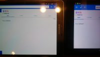
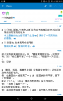
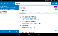
  • Reskinned our app around Android 5 and Material Design. (virtually all of the reskin applies on older versions of Android too)
  • Added an option in Settings / Reader to make the document reader paginated (swipe pages like a book instead of continuously scrolling in a vertical box), and improved performance / reliability a bit while we were at it.
  • Restored the "clipboard monitoring" option in Settings / Miscellaneous; we offered this for a few years after Pleco first came out on Android, but dropped it when it stopped working on Android 4 and nobody seemed to notice or care. Still very few requests for it, but we finally figured out why it stopped working, and since the code for it was still sitting there we figured we might as well add it back again. Anyway, turn this option on and whenever you copy a piece of Chinese text to the clipboard Pleco will automatically pop up with a definition; right now you have to go throgh Settings but if we get some interest we can easily add a more prominent toggle button and/or an option to automatically enable this at system startup rather than only having it work with Pleco running in the background.
  • Started hiding example sentences in full-text search result list items when the text being searched for appears outside of an example sentence.
  • Made the @ override prefix for flashcard pronunciations work for Cantonese along with Mandarin.
  • Added flashcard options to display Mandarin along with Cantonese before the card is revealed and to display Cantonese as a secondary pronunciation to Mandarin (so the audio / fill-in-the-blanks / etc are for Mandarin but you still see Cantonese readings too).
  • Added a command in Settings / Miscellaneous to clean up orphaned flashcard categories (to remedy some earlier bugs).
  • Shrank our default fonts just a touch - we had ported our type design over from iOS without taking into account the fact that Android devices tend to have slightly lower pixel density at a particular resolution scale, so text was (we think) a bit larger than it needed to be.
  • Added a more helpful alert for Xiaomi users when we can't access the device camera due to Xiaomi's wacky camera permission system.
  • Added Android search manager support - this is a bit flaky but if you say "OK Google, search Pleco for dumpling" it might possibly bring up Pleco with a search for 'dumpling.' We have not yet found a way to get it to recognize Chinese here. Google's voice recognizer interprets 'pleco' as having a short 'e' (pleck-o) so pronounce it like that if you want it to (possibly) understand you.
  • Fixed a bug that could prevent audio from playing in the definition screen when a custom entry was the first item.
  • Fixed a bug that prevented the Card Info screen from returning you to Organize Cards after deleting the current card.
  • Fixed a bug that caused stroke order diagrams to always be faded even with the option for that turned off.
  • Fixed a bug that could interfere with edit fields working correctly in a few popup alerts on Android 5.
  • Came up with a slighly less ugly workaround for the fast scrollbar not working correctly on Android 4.4/5, so it won't show up all the time as it did in Pleco 3.2.0/1/2.
  • Fixed a bug that added erroneous audio play buttons before example sentences in Cantonese dictionaries. (though we're working on a Cantonese TTS option for those)
  • Hid Cantonese in flashcard editing for users with the free version of our flashcard system, since you can't do Cantonese tests with the free version and we didn't want people to waste time making Cantonese cards tey can't use.
  • Rearranged the Display section of flashcard test settings to make a couple of coherent groups out of Card Text instead of just having a long random list of options there.
  • Renamed "Pinyin" in flashcard test field selection to the more neutral "Pronunciation" so as not to exclude Cantonese + Zhuyin users.
  • Fixed a bug that prevented some punctuation marks (like ellipses) from appearing correctly in flashcard Pinyin pronunciations.
  • Fixed a bug that could cause the floating DICT/STROKE/etc header to fail to appear after scrolling down in an entry via the popup reader.
  • Fixed a bug that could cause the preview entry browser for in the Oxford Chinese Dictionary E-C half to show you entries from the C-E half.
  • Fixed a bug that could cause imports to fail in certain rare cases where an extended Unicode character boundary happened to overlap with the border between two (arbitrary-sized) chunks of import data.
  • Updated to a newer version of the SQLite database engine that should significantly improve performance in some cases.
  • Fixed yet more crashing bugs.
  • Fixed a bug that could prevent reader documents from saving their locations correctly on Android 5.
 

Taichi

榜眼
Cool! But the fish eventually retired… I don't see any performance issue on xperia z3 tablet compact. Two minor bugs.
- the margin between tags is too big.
- monitor clipboard doesn't open reader even if text is long enough.
 

Attachments

  • Screenshot_2014-11-22-20-03-15.png
    Screenshot_2014-11-22-20-03-15.png
    331.4 KB · Views: 735

Taichi

榜眼
I feel vertical space is somewhat wasted. Is this expected?

Update:
Actually it looks much better on galaxy tab s 8.4, so maybe because of the rather low dpi of xperia z3 tablet compact (8 inch with 1920x1200).
 

Attachments

  • Screenshot_2014-11-22-20-20-56.png
    Screenshot_2014-11-22-20-20-56.png
    201.3 KB · Views: 727
Last edited:
I'm sure this isn't release specific but I noticed when looking up 略 (lue4) that a few entries list with the "v" instead of the u<umlaut dots above> The ones I notice are from the TL dictionary : VERB cature (see qin1lve4).

Thought I'd mention in in case you wanted to normalize all Pinyin usage across dictionaries. I'm sure you're already taking this into account when searching (can probably use either u or v for search).

A note: Pleco came up in night mode (it's night here), and it looks really amazing. I'll want to adjust the font size, since I have a Tab S with a 2048x1900 display (in 7 inch tablet), but no complaints on how nice it looks :)
 
Would there be any way to add "touch" to the abbreviations, so that they could also be explained? Example: HZ 略 / 畧 (same two components but one on top of other) This is in the GF dictionary.

It's the "HZ" that I don't recall ever seeing before. Other abbreviations such as 名 and 形 are actually known to me, but since you have them in a different font already, perhaps they could also be added with separate touch pop-up definitions. Just a suggestion, in case your suggestion list is getting short :)

**EDIT ** I see that you do have this occasionally. Found one for "N" in ABC dictionary entry for adverb 副词
 

Yiliya

榜眼
Very nice!

A few suggestions:

1) How about a bit brighter blue? Material Design is all about bright colors and your WIP screenshots had a brighter tone as well.
2) When I first saw the Android style dict/word/chars/etc tabs, I instinctively tried to swipe between them, but this didn't work. Maybe try implementing this and seeing how it works? This would be very useful for users with large screens.

P.S. Hopefully, you're still considering my request about adding hex code support for tone colors.
 
Last edited:

Taichi

榜眼
- TTS breaks right after paginated reader moves to next page.
- monitor clipboard should ignore the clipboard update made by pleco (I guess).
 

mikelove

皇帝
Staff member
@Taichi - Thanks for the bug reports. Could you expand a bit on the vertical space wasting? What would you like to see shrunk / removed? To be honest, 16:9 phones/tablets in landscape orientation aren't something we put a lot of design effort into, particularly now that most phones are wide enough to type very comfortably on in portrait orientation, but if there are places we can tidy things up a bit we'd certainly like to do that.

The logo removal was a change on Google's end; in Android 4 their design guidelines specifically told us to put logos in our action bars, in Android their design guidelines specifically tell us not to. Lot of rapid reversals, actually - if you scroll down near the bottom of this page in their guidelines you'll see that they include examples of four of their own icons from Android 4 as examples of how not to design icons for Android 5.

(personally I think they skewed a bit too minimalist on the icons - in trying to come up with common iconography for the web + devices they've sacrificed a lot of potential for creativity and beauty; they should let Android be Android and not waste a beautiful xxhdpi display on ugly little lowest-common-denominator blotches just because they want to establish their icons as some sort of universal 'standard')

@stephanhodges - few of those in Tuttle, yeah - only in definitions though (we think). HZ means "Chinese characters" - it's universal across Pleco whereas ABC's abbreviations often are specific to ABC which is they they get popups.

@Yiliya - actually this is the same color as in those preview shots, we haven't changed it at all; might be a color profile issue with the screenshot versus your device's native color space. To be honest some of the reason for the non-maxed-out brightness is a desire to have it dark enough that we can use white text / icons and hence share those things with Night Mode; makes everything a lot easier if we don't have to do separate black / gray versions for daytime. (we shed a LOT of extra icon resources with this release, which mostly canceled out the impact of adding AppCompat)

Swipeable tabs may be in Beta 2, actually - we'd ruled those out because of the potential for conflicts with STROKE but then I had the rather obvious insight recently that there's no reason STROKE has to scroll horizontally; if we make STROKE scroll vertically instead then swiping between tabs doesn't really conflict with anything (and is indeed more Android-like).

Hex code support is on the Great To-Do List but I don't know if we'll get it into this release since we'd really rather not delay it too much longer (more people installing Android 5 every day).
 

HW60

状元
Is it possible to use "Monitor Clipboard" only for short text and automatically use Clipboard Reader for longer text?
 

Taichi

榜眼
I took a photo of xperia z3 tablet compact vs galaxy tab s 8.4. I can think of following ways to save the vertical space.

- Reduce the nav bar height (at least when smaller search text is turned on).
- Allow user to change the fontsize of DICT/CHARS/WORDS/SENTS and the dictionary name annotation (e.g. GF, PLC), or maybe can just use entry body size * 0.8 or something.
- I feel top and bottom padding of the ▽DICTNAME line can be reduces as the line already serves as padding in some sense. May be you can remove the horizontal partition line altogether, but I'm not sure how it's going to look like.
- I guess this is already discussed, but allow showing Head and Pron in one line.
- This might sound crazy, but in two pane mode, how about auto scroll to the head of dictionary definitions to hide the headword and pronunciation as they are already in the list pane.
 

Attachments

  • IMG_20141123_163748.JPG
    IMG_20141123_163748.JPG
    1.1 MB · Views: 816
Last edited:

Yiliya

榜眼
One more thing. The shortcut icons. How about at least removing the gradients? Otherwise, they just don't look very Android.
 

mikelove

皇帝
Staff member
@HW60 - yes, the option to do that on startup should also apply to Clipboard Monitor but it seems to be not working; we'll fix that in Beta 2.

Re your other feedback on Add-ons, could you go into Card Info and let me know if you also have difficulty with viewing the Category and Statistics tabs in that? (trying to establish whether this is the same as another bug somebody reported by email - sounds like it might be)

@Taichi - you downloaded this from GPlay, right? If so, based on the crash log it looks like this actually relates to having handwriting open on startup (as the last input method used) on a landscape-orientation tablet - if you switch to keyboard and then kill / reopen Pleco with small search text enabled, does it start up without crashing?

Shrinking a couple of those elements in landscape makes sense, yes - greater extremes like showing headword and pronunciation in one line I'm less sure about, in part because there are a lot of other things we'd like to do with the header which will be complicated if we start making "compress everything into one line" an option.

@Yiliya - honestly, with icons we're more concerned about consistent branding than we are about seeming Android-like, particularly given that a Google Play search for "pleco" returns a list of basically every Chinese dictionary app in their catalog. Not to mention the fact that we now have a large number of users downloading unofficial APKs of Pleco from Chinese app stores (considerably more than download it from Google Play, in fact), many of whom can't read Chinese and have only the icon to go by in figuring out whether this is the right app.

Basically, we want to be as obvious as it can possibly be that this particular app is the same as the one that they saw on their friend's iPhone (or vice versa, though thankfully this is less of a problem on iOS), and since iOS icons have a very consistent style and Android icons don't it's more logical to design around iOS.

But if you've got a launcher that supports custom icons I can easily post an image of our app icon with gradients removed so you can replace it in your own copy at least. (this is another reason to focus our cross-platform icon on iOS - iOS users can only replace icons if they jailbreak, Android users need only install a third-party launcher which for power users is pretty much an essential item anyway)
 
Last edited:

Yiliya

榜眼
Honestly, Mike, can't agree with you here. Removing the gradients can't possibly do any damage to brand recognition at all.
 

HW60

状元
I always use night mode because I cannot read light color characters on very light background. Now in the DICT STROKE CHARS WORDS SENTS screen there are no color characters on black background which comes close to black on black for me.
 

HW60

状元
In flashcards/Self-graded I used to enter the characters. When I want to do that in 3.2.3, I have to tap the brush, enter the characters, and tap the brush again to be able to reveal the flashcard.
 

evgeny

Member
Full screen sketch box is now always on. it is impossible to use the buttons during a self graded test.
 

Taichi

榜眼
The crash went away after restarting the phone, and can't reproduce anymore.
Shrinking elements in portrait sounds good to me.

I think I found another bug. In portrait, sketchbox of flashcard test is always full screen regardless of the fullscreen sketchbox option.
 
Top