Here is the query.
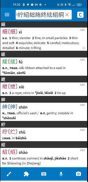
Is there a way to supress the black ribbons or bars in the display of radical search findings?

The black bars give in a redundant way only the character searched - with no other information. And if I make a screenshot of the findings for printing them out the
black bars are very dominant and make the text hard to peruse. - Could they be supressed - maybe even with the character in white fond - wich does not give
any information anyway?
_________________________________________________________________________________________________________________________________
And here is the suggestion.
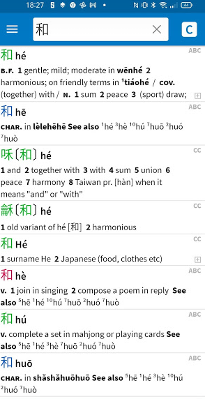
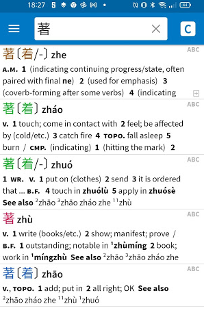
I have chosen in the settings for the search screen of the dictionary that head characters in the results are not sortetd by frequency but by pinyin and tones only. This works quite well. But it seems that the arrangement for characters with several readings is locked. And thus on gets these displays.

or

I find it very hard to remember the other readings in this display. It would be nice to have in such cases all the secondary, tertiary etc readings arranged in alphabetic
pinyin and tone order. If that was technically feasible.
Is there a way to supress the black ribbons or bars in the display of radical search findings?
The black bars give in a redundant way only the character searched - with no other information. And if I make a screenshot of the findings for printing them out the
black bars are very dominant and make the text hard to peruse. - Could they be supressed - maybe even with the character in white fond - wich does not give
any information anyway?
_________________________________________________________________________________________________________________________________
And here is the suggestion.
I have chosen in the settings for the search screen of the dictionary that head characters in the results are not sortetd by frequency but by pinyin and tones only. This works quite well. But it seems that the arrangement for characters with several readings is locked. And thus on gets these displays.
or
I find it very hard to remember the other readings in this display. It would be nice to have in such cases all the secondary, tertiary etc readings arranged in alphabetic
pinyin and tone order. If that was technically feasible.
