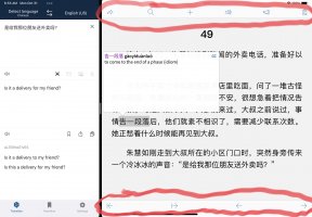
Layout change of the document reader ribbon tools?

Hello, is it just me or have the tools that display on the top/bottom ribbons when selecting text in the document reader changed positions?

I prefer to have all the buttons on the bottom ribbon (particularly the character scroll and the copy shortcut), the new layout puts them kitty corner and is a lot of distance to travel when using an iPad. Is there a way to customize the layout?
 

Attachments

  • C2058C3A-E4C3-4455-A9F7-B5243CC4CAE0.jpeg
    C2058C3A-E4C3-4455-A9F7-B5243CC4CAE0.jpeg
    414.4 KB · Views: 136

mikelove

皇帝
Staff member
We actually made that change at the request of a bunch of users who reported that the buttons in split-screen mode were too cramped; however, we can certainly add an option to revert that change. (or just default to the one bar again when our app takes over most of the screen)

In the meantime, if you expand Pleco to full-screen it should go back to the old layout.

EDIT: it looks like actually we just made a coding mistake; the switch to two bars was supposed to be tied to compact width class (= Pleco occupying half of the screen or less) but instead it was tied to any sort of split-screen mode. So we'll upload a tiny update today to fix that bug - should be out in a couple of days. Thanks for bringing this to our attention.
 
Last edited:
Top