mleoj
Member
Hello,
I really like Pleco chart feature, for me I’m really motivated by these kind of visualisations.
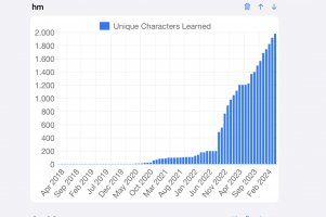
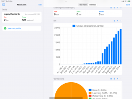
Most useful for me is the unique characters learned chart. however since I’m only really working on that one vocabulary set for a certain time but the overall date period of all cards reaches back much further, my axis ranges somehow not optimal. My monthly increments of overall character only displayed via tiny bar length increase. And a large portion of the chart is just played as bars with zero height.
It would be great if I can somehow define either the period for the chart to render or the axis range.
However, I see that this is probably quite a pain to develop and not really a major case for everyone. still wanted to let you know.
Thank you
Attachments
Last edited:


