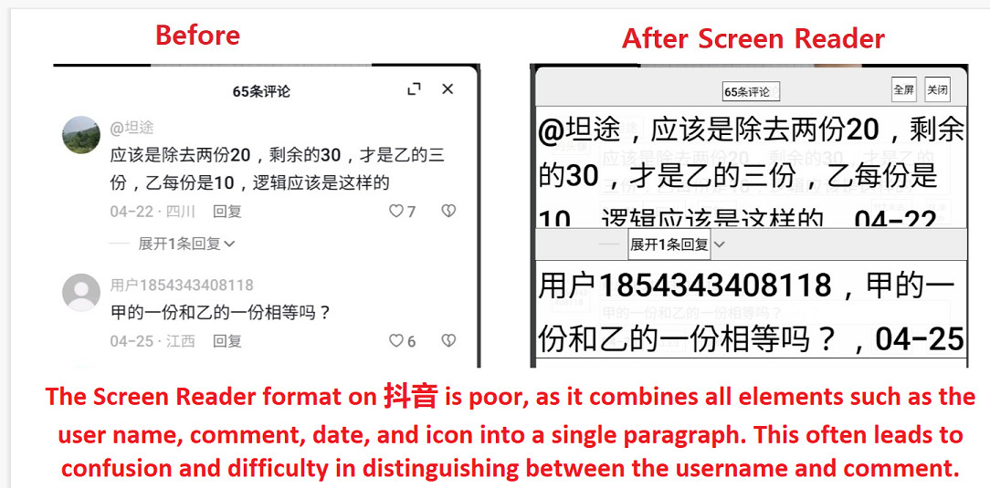
I've noticed that the format of Screen Reader on 抖音 can be difficult to read, because all the elements like the user name, comment, date, and icon are squished together into a single paragraph. It's hard to tell them apart sometimes as it's unclear where the username ends and the comment begins.
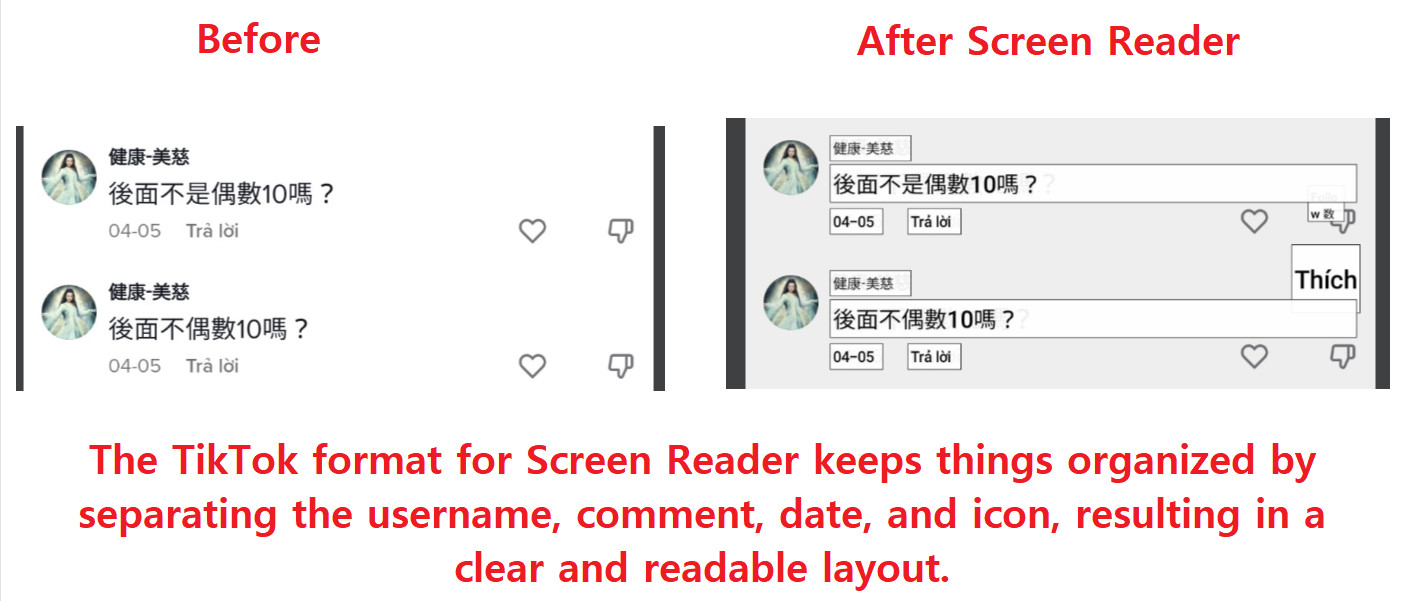
On the other hand, TikTok's Screen Reader format is much better. It keeps everything separate and easy to follow.
I'm wondering if anyone else has experienced the same issue on Screen Reader of 抖音? If so, have you found any workarounds?


On the other hand, TikTok's Screen Reader format is much better. It keeps everything separate and easy to follow.
I'm wondering if anyone else has experienced the same issue on Screen Reader of 抖音? If so, have you found any workarounds?
