
You are using an out of date browser. It may not display this or other websites correctly.
You should upgrade or use an alternative browser.
You should upgrade or use an alternative browser.
3.1.4 Bug Report / Feedback Thread
- Thread starter mikelove
- Start date

Okay, I've been using the long press shortcut for a few days and I found out that it's still too inefficient for me. Can I request for the 'Exit button everywhere' shortcut again, please? I think that a new 'forwards' button to complement the 'back' button would be very useful too.
I also noticed that the '>' button for jumping to other entries is located on the top right corner on Android, which is again different from both iPhones and iPads. When you do decide to unify the location of this button, at which corner would you put it?
I also noticed that the '>' button for jumping to other entries is located on the top right corner on Android, which is again different from both iPhones and iPads.
When you do decide to unify the location of this button, at which corner would you put it?
Last edited:

Shun
状元
Hi, when scrolling through a dialog with flashcard categories in it, the Flashcard Info dialog, for example, the category names/paths arent't left-aligned anymore--they seem to be centered like the fields above them. (see screenshot) This is reproduced by scrolling down until the categories are hidden at the top, then scrolling back up again.


@scykei - adding that to every toolbar would be a bit complicated now, so we'd need a lot more user requests before we could consider it. Have you tried the Favorites bar yet? (Settings / Miscellaneous) Doesn't work on iOS 6, but 3.1.4 is most likely our last iOS 6 release anyway.
The > button is actually going to be moving to the popup bubble itself soon, we think - its current location is much too confusing, there's no visual connection between it and the dictionary entry you're looking at in the bubble. The disconnect between iOS and Android is less than ideal but changing one to match the other would be far worse in terms of user hassle so we're waiting until we can eliminate the problem altogether.
@Shun - thanks; particular property of those flashcard name rows isn't being set correctly on a scroll, it seems.
The > button is actually going to be moving to the popup bubble itself soon, we think - its current location is much too confusing, there's no visual connection between it and the dictionary entry you're looking at in the bubble. The disconnect between iOS and Android is less than ideal but changing one to match the other would be far worse in terms of user hassle so we're waiting until we can eliminate the problem altogether.
@Shun - thanks; particular property of those flashcard name rows isn't being set correctly on a scroll, it seems.
Have you tried the Favorites bar yet?
Yes I have. As I mentioned before, the sliding motion gets very tiring too. I find myself doing the three taps because it somehow feels much faster than both sliding the screen and holding on a button, although it probably isn't. It would make everything so much easier for me if I could jump back to the search screen with the keyboard pulled up and the text field cleared with a single tap.
I don't think you need to add it to every toolbar. I just need one that jumps out of the definition screen.
EDIT: I also noticed that the settings screen looks weird on my iPod on iOS 6 when I have the dark theme turned on because the outside borders are still bright. Is it a limitation of iOS 6?
But where do we put it? That's the problem - now that the flashcard and edit entry buttons are there, there's no room in that top toolbar unless we remove something else. And we're trying really, really hard not to add off-by-default options unless there's very strong user demand for them, which we're not seeing for this so far.
Have you tried using two-panel (list + definition on the same screen) mode? It works in portrait orientation too if you enable it, and you can stack the list + definition vertically instead of horizontally if you don't want a cramped reading experience. Would give you the one-tap ability to clear input + start a new search that you want, but would also spare you an extra tap or two going into definitions (presumably just as critical). We expect this to be particularly popular on the new large-screen iPhone Apple is expected to announce next month.
Have you tried using two-panel (list + definition on the same screen) mode? It works in portrait orientation too if you enable it, and you can stack the list + definition vertically instead of horizontally if you don't want a cramped reading experience. Would give you the one-tap ability to clear input + start a new search that you want, but would also spare you an extra tap or two going into definitions (presumably just as critical). We expect this to be particularly popular on the new large-screen iPhone Apple is expected to announce next month.

Can't reproduce this but:
One time brining Pleco back from running in the background - Pleco turned into complete black & white (including hamburger pull out menu button / language toggle button / tone colors) as if the pop-up definition was open (I'm assuming that's what is taking my colors away!), but my screen was on search results so I don't really know how pop-up definition would be open! and the search results were clickable everything just stayed in black and white.
I removed it from running in the background and then reopened Pleco and everything was okay again...
One time brining Pleco back from running in the background - Pleco turned into complete black & white (including hamburger pull out menu button / language toggle button / tone colors) as if the pop-up definition was open (I'm assuming that's what is taking my colors away!), but my screen was on search results so I don't really know how pop-up definition would be open! and the search results were clickable everything just stayed in black and white.
I removed it from running in the background and then reopened Pleco and everything was okay again...
But where do we put it?
Isn't there a little space next to the button to add flashcards?
And we're trying really, really hard not to add off-by-default options
Why though? I actually think that this might be a feature that a lot of people will appreciate. People might not be aware of how convenient this simple shortcut is until they actually use it.
Have you tried using two-panel (list + definition on the same screen) mode?
Tried it for a few days. I still don't really like this. It's uncomfortable on my iPad and unusable on my iPod. I find that I always ended up highlighting the headword to jump into the entry full screen, which sort of defeats the purpose of doing this. If this is my best option, then I would want to request a shortcut that can quickly make the definition panel full screen when I need it.
> Isn't there a little space next to the button to add flashcards?
That space is only there if you haven't created a user dictionary entry, otherwise it's the button for adding / editing an entry. And will soon also be functioning as a "notes" button too.
> Why though? I actually think that this might be a feature that a lot of people will appreciate. People might not be aware of how convenient this simple shortcut is until they actually use it.
Simply put, we've got too many options and in addition to making our app more confusing for users they greatly complicate testing. It's an especially big minefield on iOS because if we break something we have to wait at least a week for Apple to approve a fix.
This particular one comes with additional complications because as I said we already have another button we want to put in the remaining space - adding an option for an X button means taking away one of those other buttons, which means coming up with an alternate way for people to access whatever functionality was in the missing button.
> Tried it for a few days. I still don't really like this. It's uncomfortable on my iPad and unusable on my iPod. I find that I always ended up highlighting the headword to jump into the entry full screen, which sort of defeats the purpose of doing this. If this is my best option, then I would want to request a shortcut that can quickly make the definition panel full screen when I need it.
It's the default mode on iPad - had you reconfigured your iPad to show you a full-screen list instead?
One thing we have considered that might help in your case is what we're calling "layered two-panel mode" - basically Apple's UISearchViewController, there's a search bar at the top but a full-screen definition below and when you tap on the search bar a list pops up to overlay it. The main tradeoff is that it makes the interface less friendly to general browsing. since the search result list is now something transient instead of something fixed.
That space is only there if you haven't created a user dictionary entry, otherwise it's the button for adding / editing an entry. And will soon also be functioning as a "notes" button too.
> Why though? I actually think that this might be a feature that a lot of people will appreciate. People might not be aware of how convenient this simple shortcut is until they actually use it.
Simply put, we've got too many options and in addition to making our app more confusing for users they greatly complicate testing. It's an especially big minefield on iOS because if we break something we have to wait at least a week for Apple to approve a fix.
This particular one comes with additional complications because as I said we already have another button we want to put in the remaining space - adding an option for an X button means taking away one of those other buttons, which means coming up with an alternate way for people to access whatever functionality was in the missing button.
> Tried it for a few days. I still don't really like this. It's uncomfortable on my iPad and unusable on my iPod. I find that I always ended up highlighting the headword to jump into the entry full screen, which sort of defeats the purpose of doing this. If this is my best option, then I would want to request a shortcut that can quickly make the definition panel full screen when I need it.
It's the default mode on iPad - had you reconfigured your iPad to show you a full-screen list instead?
One thing we have considered that might help in your case is what we're calling "layered two-panel mode" - basically Apple's UISearchViewController, there's a search bar at the top but a full-screen definition below and when you tap on the search bar a list pops up to overlay it. The main tradeoff is that it makes the interface less friendly to general browsing. since the search result list is now something transient instead of something fixed.
Also, would it help matters any if we highlighted the search field when you return from the definition screen if the keyboard is open? We've been considering making that change anyway, and with that, you're basically getting back to enter a new search with just a single tap on the back button.
It's the default mode on iPad - had you reconfigured your iPad to show you a full-screen list instead?
I guess I have.
One thing we have considered that might help in your case is what we're calling "layered two-panel mode"
That would be a major change. I have been trying to think of how this can affect my search behaviour. It might work.
Also, would it help matters any if we highlighted the search field when you return from the definition screen if the keyboard is open?
Sounds like a great idea! It would definitely help.
Have you ever thought of implementing a permanent favourites bar at the bottom of the screen instead of accessing it by sliding from the side of the screen? You can make it similar to the fan button in the old Pleco to toggle it. This allows us to toggle character sets and we watch the changes live again (which was very useful when I was learning the other character set, but not so much now that I've already mastered them both).
@scykei - thought about it, but it's a LOT of work to make that available everywhere so again unless it was on by default for everybody (which I don't think makes sense - most people don't really care about accessing these features that often) I don't think we could justify doing it.
@Nabil - Were you using iCloud sync? Reboot your device and that should clear this up. If not, check Settings / Flashcards - if you were using iCloud sync before and are not using it now, re-enable iCloud sync and choose the option to use the database in the cloud rather than the one on your device.
@Nabil - Were you using iCloud sync? Reboot your device and that should clear this up. If not, check Settings / Flashcards - if you were using iCloud sync before and are not using it now, re-enable iCloud sync and choose the option to use the database in the cloud rather than the one on your device.
I went from the English entry for
seitan with pop up definition up for 面筋 and some how managed to go back to the search results page with popup definition still up/open! (Which can be seen below: search results page (with one result) covered by popup definition and with popup definition boarder.)
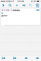
When I dismissed the popup definition: my colors got removed, again!

So I guess my hunch about popup definition having something to do with the removal of colors was right after all.
Haven't been able to reproduce this - not sure what gesture/button/etc keeps the popup definition open while moving to a separate view but apparently there is one...
seitan with pop up definition up for 面筋 and some how managed to go back to the search results page with popup definition still up/open! (Which can be seen below: search results page (with one result) covered by popup definition and with popup definition boarder.)
When I dismissed the popup definition: my colors got removed, again!
So I guess my hunch about popup definition having something to do with the removal of colors was right after all.
Haven't been able to reproduce this - not sure what gesture/button/etc keeps the popup definition open while moving to a separate view but apparently there is one...