iPad Flashcard UI

rizen suha

状元
on a lateral note, on the value of pleco flashcards and a suggestion for improvement. the wealth of info available in the dictionaries should ideally be organized/displayed right alongside a particular flashcard. beyond (as it is now) displaying just a single dictionary entry. like a command central overview (on larger tablets) of fx etymology/examples/variants/components/pronunciations/typefaces/etc. that is, enhancing the access to dictionary contents; eliminating the need for having to jump "out of" the flashcard and thereafter back into the flashcard. at least, that is where i see the differential and unique value of pleco flashcards: aimed at making life easier for the user who is not just interested in learning stuff by heart but rather in understanding and digging deeper (and who also thinks that this in the long run will allow him/her to learn more efficiently). i use flashcards because it is a motivating companion, not for rote learning but in "meditating" over this wonderful language. i would love pleco to offer easier access to dictionary contents from a flashcard. even if that does not happen, i will continue to use pleco flashcards because of the wealth of available info. edit: having the menu items [DICT] [STROKE] [CHARS] [WORDS] [SENTS] (already available in the dictionary view proper) directly available on the flashcard screen would comply with 80% of the "command central" aspiration that i mentioned above.
 
Last edited:

mikelove

皇帝
Staff member
@rizen suha - we've been thinking about that, to be honest I'm a little worried about clutter though; I'd rather have them one tap away, though perhaps better visually integrated than the current 'view as dictionary entry' button (flipping a card, say, or swiping down, or something like that).
 

rizen suha

状元
@mikelove thanks for your reply. happy to hear you have thought about it. but, come on, please, at least on the larger tablets (normal ipad and up) there is a ton of space available. i love the ui design of pleco but sometimes you are a little too zen-conservative in my opinion. one tap out and one tap back are two taps too much. it is a much bigger deal than reclaiming unused space for immediate access to functionality - functionality that sets pleco apart from the competition and is essential to many users. anyway, make it an option how much functionality should be available. dont use automatically the clutter argument. if you say that it is too much programming for too little demand and strategic advantage for pleco, you certainly know better than i, and i can accept that. after all, i just want what is better for pleco since i plan on using this app for the next 50 years. thanks.
 
Last edited:

mikelove

皇帝
Staff member
It's not about available space - plenty of that even on an iPhone - but about distractions; people would rather have less clutter around their flashcards so they can concentrate on the stuff they want to learn, we get far more requests for a *simpler* flashcard test interface than for a more powerful one. So even reviewing flashcards on a giant iPad screen, my sense is that most people would like to see the word and a few buttons and not much else.

In theory I suppose this could be yet another settings option, but at least at the moment I'm more inclined to try to come up with a single solution everyone can live with by offering all of that functionality one tap away via an unobtrusive button or gesture or some such.
 

Shun

状元
It's not about available space - plenty of that even on an iPhone - but about distractions; people would rather have less clutter around their flashcards so they can concentrate on the stuff they want to learn, we get far more requests for a *simpler* flashcard test interface than for a more powerful one. So even reviewing flashcards on a giant iPad screen, my sense is that most people would like to see the word and a few buttons and not much else.

In theory I suppose this could be yet another settings option, but at least at the moment I'm more inclined to try to come up with a single solution everyone can live with by offering all of that functionality one tap away via an unobtrusive button or gesture or some such.

I think it could be done as follows, perhaps as part of a larger toggle switch between an "pro mode" and an "easy mode", which I've read is being planned for the 4.0 Flashcards system.

When showing the user one side of a card and asking them for the answer, everything on the screen can stay simple or be made even simpler, so the user can focus on the question in front fo them. But when the other side of the card is revealed, a lot more information could be shown, in fact, the words' characters could automatically be drawn from STROKE, and the first five entries of the WORDS and CHARS tab, as well as the SENTS tab could be displayed. I do believe automatically seeing these things might help subconscious language acquisition, just by seeing them subsconsciously while studying. Of course, this would only have to be an option. But it would be an innovative way of using all that space.

Of course, there are also useful learning effects of having to think of the solution before tapping to check it. But there are also obvious benefits to seeing it automatically. If you like, I or rizen could try designing a drawing of an iPad screen containing all of this information, just for reference. (I wouldn't at all be disappointed if it weren't to be realized that way. :) )
 

rizen suha

状元
@Shun of course the info, simple or detailed, should be hidden before revealed:) great idea, that of making a mock up of a solution. would love to see that. many thanks.
 

mikelove

皇帝
Staff member
Possibly, but again I think a lot of people would prefer to focus on a smaller amount of information they're trying to learn + not be overwhelmed with all of that other stuff. So again it would have to be an off-by-default option.

"Expert mode" is actually not an overall setting, at least we've currently designed it; rather, we have a bunch of different types of flashcard profile with different sets of settings, some simpler than others, all of which map to our actual flashcard settings (which are much more complicated, relying on a bunch of custom rules / filters that very few users are going to want to fiddle around with).

So there's one mode that's a nearly perfect mimic of our current flashcard system (developing that has actually been a very useful exercise in making sure our new system can accommodate a lot of different types of flashcard test, since our current system does a lot of things oddly) - crucial since as long as we've got that working well we can leave the other stuff slightly unfinished and nobody will be any worse off while they wait - one that resembles Anki (which isn't that big a departure from our current system either - basically just removing any options that would cause Pleco to *not* behave like an SM-2-based flashcard system plus adding intra-session scheduling, the ability to shoot yourself in the foot by limiting the number of reviews even when you have a lot more cards due, and the ability for cards to work on short / fixed intervals at some points in their life cycle), one much simpler mode ("Pleco New") that reflects our own feeling about how flashcards ought to work (spoiler: no algorithmic intervals at all), possibly a 'custom' mode that exposes some of the flexibility of our new system but not all, and whatever other ideas we come up with.
 

Shun

状元
@Shun of course the info, simple or detailed, should be hidden before revealed:) great idea, that of making a mock up of a solution. would love to see that. many thanks.

Great, I will come up with a non-binding suggestion soon. :) It‘s easy to create.
 

Shun

状元
Hi MIke and rizen,

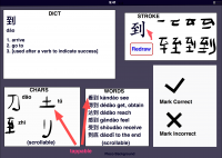
here is a mockup I quickly put together. One idea was that the Strokes field on the right shows the character animation once, with a Redraw button to redraw it, along with a scrollable sub-field to its right containing each writing step, each step showing one stroke more.

Pleco Idea.png

The Chars field on the lower left is somewhat superfluous, I think, since this information requires one to look at the information in peace.
The Words field further right could be useful, but only if the frequency-sorted compound words are often used. If they are rare, they would also take too much time to look at, and would likely not be worth displaying.

In conclusion, I'm somewhat doubtful if it's always possible to make all screen contents relevant automatically. Too often, what one is looking for is located futher down, which would force one to scroll through a smaller pane than one would have available with an exclusive view which one would get by explicitly tapping on the function.

So if it's more beautiful than this, perhaps it might make sense. Perhaps it could only display the Tuttle Learner Dictionary for beginners, more advanced learners need to browse through things more anyway. Maybe other users have different thoughts.

Cheers, Shun
 

rizen suha

状元
@Shun pure genius. this was exactly what i was looking for. it is a perfect starting point for beginning to visualize the potential of pleco flashcards. not for rote memorizing but for mentored study, anchored in understanding. great potential indeed. i hope mike/you and others will take take this idea further, developing more mock-ups. brilliant. many thanks indeed.
 

Shun

状元
You're welcome & thanks! I just think the content has to be really good. Perhaps Tuttle might have the right content, but also the programmer has to believe in such a layout for it to work.
 
Last edited:

mikelove

皇帝
Staff member
@Shun / @rizen suha - this is interesting - thanks for the mockup - but to be honest it's not diminishing my sense that people are going to be overwhelmed with data. But that's not a no, just a problem of finding the time to add a fairly labor-intensive off-by-default option - I can certainly see how it might be valuable for some users (and this 'panel' concept in general is actually rather intriguing), I just don't think we can do it for all of them.
 
Last edited:

mikelove

皇帝
Staff member
Moving this to a separate thread to split it off from mostly unrelated discussion of backups. (Which I’ve now deleted entirely after a frank exchange of views with the gentleman in question)
 
Last edited:

Shun

状元
@Shun / @rizen suha - this is interesting - thanks for the mockup - but to be honest it's not diminishing my sense that people are going to be overwhelmed with data. But that's not a no, just a problem of finding the time to add a fairly labor-intensive off-by-default option - I can certainly see how it might be valuable for some users (and this 'panel' concept in general is actually rather intriguing), I just don't think we can do it for all of them.

You‘re welcome! Yeah, the data has to be really good, almost expressly prepared for such an overview screen, and not requiring any interpretation, if you don't want to overwhelm people with it. I'm glad you like the panel idea, I think it allows one to navigate inside different longer lists as if they were in an interactive book. Maybe panels will make an appearance elsewhere in the app once.

It may also be interesting to offer all five panels at the same time in the Dictionary part of the app, so instead of tabs, you'd have DICT, STROKE, CHARS, WORDS, and SENTS all in view, and you wouldn't have to think about changing tabs at all. You would intuitively look at the place on the screen you're after. There could also be a button to expand a panel to the entire screen and then a button to shrink it back. (Somehow, this reminds me of UI design from the 1980s. But it may well be fruitful to resurrect some ideas.)
 
Last edited:

rizen suha

状元
@Shun. thanks. i like your proposal much more. this one would be for a very first approximation. there would still be a very ample margin for layout improvements (fx reclaiming space by doing away with some of the card metaphor; fx unnecessary borders and too large buttons)...
 

Shun

状元
Sure, they‘re just two different ideas. They’re not really mutually exclusive, either. Gotta continue reading Hong Lou Meng now, it is rather long. :)
 

rizen suha

状元
@Shun enjoy. no not mutually exclusive. but something like your solution would be the end goal. with something like that, plecos flashcard system could become your personal study room, teacher and mentor included. it would set itself apart from other systems whose basic philosophy is repetition, repetition, repetition. however clever a chosen repetition scheme may be, it does not work for me nor many others, unless, over and beyond repetition, "understanding" and active interest is applied. so (in fear of repeating! myself) anything that will allow me to get into a mode of meditated study instead of paced "progress" will be much more enjoyable and productive. thanks.
 

HW60

状元
the ability to shoot yourself in the foot by limiting the number of reviews even when you have a lot more cards due
I am waiting for several years now for a considerable improvement of the flashcard system, which already was promised for Pleco 3.0 and is now talked about for the sometimes in the future suddenly falling from heaven Pleco 4.0. Like in 3.0 with its 65,000 colours to choose from, the discussion now seems to indicate that Pleco again will take a step from the best software to the best looking software, while the enthusiasm for planning real improvements like limitating the number of reviews looks somewhat limited.
 
Top