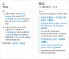
Here's a nearly-finished shot of our new type design, showing off its flexible handling of different-sized example sentences. (the bold Chinese font is a temporary substitute but the others are probably the ones we're going to use)

You are using an out of date browser. It may not display this or other websites correctly.
You should upgrade or use an alternative browser.
You should upgrade or use an alternative browser.
New Type Design
- Thread starter mikelove
- Start date
character
状元
That looks very nice. I like the clean look and the use of space. I esp. like how in the second image the characters, pinyin, and English are separated by newlines.
WRT usability, two things:
1) Will it be possible to customize the color used for characters and pinyin? I'd prefer to have more contrast, something closer to black on white.
2) The vertical bars in the second image to me indicate change bars. http://help.adobe.com/en_US/FrameMaker/ ... mt_03.html Perhaps instead of those bars, use a horizontal separator? A small & light horizontal separator would also enhance the overall lightness of the design; the thick change bars detract from it.
Tezuk said:If PTH is Putonghua, I guess CAN must be Cantonese!!!
Yes - not quite ready yet but we're certainly planning around it.
character said:That looks very nice. I like the clean look and the use of space. I esp. like how in the second image the characters, pinyin, and English are separated by newlines.
Thanks!
character said:WRT usability, two things:
1) Will it be possible to customize the color used for characters and pinyin? I'd prefer to have more contrast, something closer to black on white.
Yes, though the color in this is a little off - the real default will be darker and a slightly different hue.
character said:2) The vertical bars in the second image to me indicate change bars. http://help.adobe.com/en_US/FrameMaker/ ... mt_03.html Perhaps instead of those bars, use a horizontal separator? A small & light horizontal separator would also enhance the overall lightness of the design; the thick change bars detract from it.
We're already using those to separate sub-entries, but I see your point about the example bars being a bit heavy - we'll see what we can do on that.
dangdang said:Why is there an "a" in "Jingguo"? Should not be "Jinagguo". Correct?
Yep - just a typo.
character
状元
Thanks Mike.
Beyond the existing meaning for the vertical bar, it's using a vertical bar to indicate a horizontal separation. Maybe have different kinds of horizontal separators, such as a space, a simple separator, a heavier separator, etc.We're already using those to separate sub-entries, but I see your point about the example bars being a bit heavy - we'll see what we can do on that.
character said:Beyond the existing meaning for the vertical bar, it's using a vertical bar to indicate a horizontal separation. Maybe have different kinds of horizontal separators, such as a space, a simple separator, a heavier separator, etc.
Well it's a fundamentally different relationship - the examples are illustrating the definitions. So it seems like they should be linked to them rather than separated from them. The blue lines may be a bit heavy but the basic idea that these ought to be using a different indicator than sub-entries makes perfect sense to me at least.
radioman
状元
Now that I'm paying attention a little more, A few more things.
In the spirit of visual contrast, I really prefer to have an option of NO coloration - all white on black or black on white. Especially for the Hanzi, which I like to have as much contrast as possible. Therefore, the demarcation becomes more important.
For what it's worth, 有道词典 app provides a great presentation, by far my favorite application for sample sentences. There is no pinyin, but they number the sample sentences, provide what dictionary it came from, and present all on the same screen. They also go out and grab resources on the internet. Argue for off line or not, but the info pulled from the net is very much complementary and useful. However, with that said, Pleco has a lot of great resources internally, and it seems a lot of Pleco's and 有道词典's are from the same sources. So that, if I wanted to have a definition with many sample sentences, I would want them all collated and presented on the same page, not have to flip to different dictionaries. That is, any and all sentences for a particular search, in whatever of the 8 or 9 dictionaries I have in Pleco, would be listed on one screen, underneath the primary dictionary dictionary (that could be cycled to the next dictionary).
So basically a unified page with definitions, and sample sentences all together.
With regard to scrolling from one sentence to the next, I don't really care if I have to scroll, as long as all the info was there for me to review.
And if there was a way to save specific sample sentences to a list or flashcard, rather than having to do the cut-and-paste game, I'd be all in.
character
状元
I think a different indicator is a fine idea. I would just prefer it not have other strong connotations. Perhaps use different indenting, a different font, a configurable colored area under the example, etc.mikelove said:Well it's a fundamentally different relationship - the examples are illustrating the definitions. So it seems like they should be linked to them rather than separated from them. The blue lines may be a bit heavy but the basic idea that these ought to be using a different indicator than sub-entries makes perfect sense to me at least.
I did find a partial counter example: http://daringfireball.net/linked/2012/10/20/windows-rt But note that Gruber indicates that it's a quotation with a leading attribution line.
Perhaps the sample sentences could be indented, and on the left would be one or more buttons to perform those operations. Two birds, one stone.radioman said:And if there was a way to save specific sample sentences to a list or flashcard, rather than having to do the cut-and-paste game, I'd be all in.
Dear Mike,
I think the fonts and style looks very nice.
And I would rather have a more compact layout. I'd like to have the option to have the headword, the pinyin and the definition all on the first line without a carriage return. I'd like to be able to set the line spacing to 1.5 instead of 2. I would like 4 separate font size controls: 1) headword font size, 2) pinyin font size, 3) definition Roman letter font size, and 4) definition Chinese character font size. I would like different font sizes for definition Roman and Chinese fonts because when I set the definition font size large enough to be able to read even the most complicated Chinese characters with over 20 strokes, the font size for Roman characters (which have many strokes) is much larger than it needs to be to be easy to read.
I understand that this grates against design sense. And it is very functional for me from the standpoint of getting as much information as possible, in a readable format.
John
scykei said:I wonder how it will look like on an iPad? It would have to look very different with the extra space, right?
We've got an alternate design for that, actually - bit more whitespace, basically. But our general goal with the iPad is to display more information rather than displaying the same information differently - we may not get all the way there in this release (we've been a bit hesitant because we knew an iPad Mini was coming and that it would totally screw up whatever plans we made) but basically we think that's the best way for a dictionary to leverage a 10" screen.
radioman said:In the spirit of visual contrast, I really prefer to have an option of NO coloration - all white on black or black on white. Especially for the Hanzi, which I like to have as much contrast as possible. Therefore, the demarcation becomes more important.
Well if the color is customizable then it can certainly be made black. (and we pretty much make all text colors like this customizable, for the sake of color-blind people if nothing else - always warms my heart when someone writes to thank us for providing a tone coloring system that they can actually use)
radioman said:For what it's worth, 有道词典 app provides a great presentation, by far my favorite application for sample sentences. There is no pinyin, but they number the sample sentences, provide what dictionary it came from, and present all on the same screen. They also go out and grab resources on the internet. Argue for off line or not, but the info pulled from the net is very much complementary and useful. However, with that said, Pleco has a lot of great resources internally, and it seems a lot of Pleco's and 有道词典's are from the same sources. So that, if I wanted to have a definition with many sample sentences, I would want them all collated and presented on the same page, not have to flip to different dictionaries. That is, any and all sentences for a particular search, in whatever of the 8 or 9 dictionaries I have in Pleco, would be listed on one screen, underneath the primary dictionary dictionary (that could be cycled to the next dictionary).
We're going to have an "all examples from everywhere" screen ourselves, it's another one of those features that's waiting on all of our dictionaries to be semantically tagged. But in general I don't think that can or should replace in-entry example sentences, because those are designed to illustrate a particular point and linked to a particular definition - with a word that has half a dozen or more different meanings you really need specific examples for each rather than an undifferentiated mishmash of them.
As for online resources: as you say we already have access to most of that data, and in general I'd rather not compromise our current or future search engine enhancements by having to work in a slow, inconsistently-formatted online component. For example, it would be pretty much impossible for us to merge in search results from an online database in real-time, as we've now got our software doing for offline results. Offline delivers a much better experience, and for the most part, if somebody else is offering some useful Chinese dictionary data for free online, either a) that data's open-source and we can offer it for free, b) that data is available under relatively loose / generous licensing terms and we can license it too and not charge an arm and a leg for it, or c) that data is proprietary but is within the range of what we can afford to develop ourselves. There are one or two exceptions to these (CantoDict, e.g., though we're getting around that with a combination of b) and c)) but I'm not aware of any compelling data online right now that it's not within our ability to potentially offer offline.
radioman said:And if there was a way to save specific sample sentences to a list or flashcard, rather than having to do the cut-and-paste game, I'd be all in.
That's coming too, similarly a semantic tagging thing. (the most prominent holdout on that is GF - we've finally negotiated a deal for the 2nd edition with its glorious semantic XML data, but we have yet to sign that deal or take delivery of said data, yet there's no point to spending time tagging the 1st edition when we're planning to give everyone a free upgrade)
character said:I think a different indicator is a fine idea. I would just prefer it not have other strong connotations. Perhaps use different indenting, a different font, a configurable colored area under the example, etc.
Well I don't think that "example" and "quote" are all that different really - in fact I'd say that a quotation is the single best equivalent to an example sentence among common, Markdown / forum software / etc supported text formats. Even more so in dictionaries that quote from actual sources, as our new Classical dictionary and a few of the other ones we've licensed do.
character said:Perhaps the sample sentences could be indented, and on the left would be one or more buttons to perform those operations. Two birds, one stone.
That's one thing we've considered, though my inclination now is actually to have those be separate icons tied to a particular line of text.
johnh113 said:And I would rather have a more compact layout. I'd like to have the option to have the headword, the pinyin and the definition all on the first line without a carriage return. I'd like to be able to set the line spacing to 1.5 instead of 2. I would like 4 separate font size controls: 1) headword font size, 2) pinyin font size, 3) definition Roman letter font size, and 4) definition Chinese character font size. I would like different font sizes for definition Roman and Chinese fonts because when I set the definition font size large enough to be able to read even the most complicated Chinese characters with over 20 strokes, the font size for Roman characters (which have many strokes) is much larger than it needs to be to be easy to read.
We've actually opted for a slightly more compact Roman font (as you may have noticed) as an attempt to help with that disconnect, but I do see the virtue in making those separately adjustable too. Headword / Pinyin / Definition on separate lines may be hard to avoid, though, as it's probable that in the near future we'll have at least some cases in which the headword / Pinyin are "locked" to the top with the definition scrolling below.
The Chinese font is nicely stylised and very clear, even in the busier characters. The English font is in line with the Helvetica Neue-like trend of clean, modern typefaces that we've been seeing lately on all platforms. Both are gorgeous.
I love you.mikelove said:we pretty much make all text colors like this customizable, for the sake of color-blind people if nothing else
Vzzzbx said:The Chinese font is nicely stylised and very clear, even in the busier characters. The English font is in line with the Helvetica Neue-like trend of clean, modern typefaces that we've been seeing lately on all platforms. Both are gorgeous.
Thanks! The Chinese one we're especially happy with, since it bucks the trend of ugly-looking Hei fonts which seem to have infested almost every major OS now.
character said:I've come across the "vertical bar as quotation indicator" a number of other times now, so I guess its use has broadened from change bar in standard use. Live and learn.")
Ah, good to know.
cclaerhout
秀才
A question about example sentences, would it be possible to do the same with the flashcard system, with a kind of "bbcode" system for example?
cclaerhout said:A question about example sentences, would it be possible to do the same with the flashcard system, with a kind of "bbcode" system for example?
Yes, not happening in this release but certainly might in another release or two - I think we'd probably use Markdown rather than bbcode since it's a much more convenient syntax to enter / edit on an iPhone.
cclaerhout
秀才
Yes, not happening in this release but certainly might in another release or two - I think we'd probably use Markdown rather than bbcode since it's a much more convenient syntax to enter / edit on an iPhone.
This is a great news. Could you keep us inform about this please?
Knowing this now, I'm going to use a bbcode for my "php/sql" flashcards that I would convert to your Markdown syntax when exporting to Pleco
And by the way, great and clean interface
Edit: just to check, this Markdown syntax will be common to iOS & Android?
cclaerhout said:Edit: just to check, this Markdown syntax will be common to iOS & Android?
Oh yes, there's no reason I can think of why we would use it on one and not the other. Though it certainly might come to one platform first, or support certain features (like embedding custom images) first.