Thanks for the feedback.
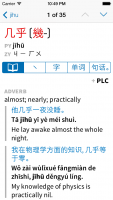
The bar does feel heavy, given iOS 7's look. Perhaps remove the rounded rect and the separating lines as a start? I think the stroke order back tick

isn't the best icon. One thought is to replace the bar with a More button which shows a menu of choices with more descriptive text. People generally aren't going to whip from one of those choices to another, so getting to each one doesn't have to be as fast as possible.
Removing the border makes sense (or at least the end caps), but I'm worried that if we just have text and nothing else (as was actually the case in an earlier design) it won't be sufficiently obvious that these are tappable. The tick mark isn't great - I like the double metaphor (each tab is also an example of the thing it describes, except for the first one) but perhaps we'd be better off just doing it all in English.
As far as a "More" button, I actually feel like people are quite likely to want to flip between multiple tabs - between compound words, extra examples, and character decompositions I daresay many Pleco users will find themselves flipping back and forth on almost every entry. We had an earlier design with two tabs at the top (in the navigation bar) - a "dict" and an "info" tab, with the added information from the other four tabs under that "info" section - but I find myself liking this version better since "dict" and "info" seemed like arbitrary distinctions and (as I said above) when you change something in the top bar you generally expect it to affect everything below it.
I'm a little confused as to the +PLC -- is that some reference to combined search results?
Actually it's how you pick a specific dictionary's entry to create a flashcard from (flashcards remain one-dictionary-at-a-time for brevity's sake). Though the fact that the + is non-obvious suggests that we ought to either make it bigger or add another flashcard icon somewhere else to automatically create one from the first entry. Or perhaps pick a better icon than +, like a star or a bookmark.
I think it's great you have Zhuyin fuhao available but I'm guessing the majority won't use it, so can the display of it be turned off?
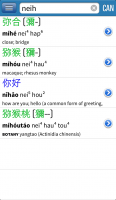
Certainly, as can Cantonese display (not shown in this screenshot).
I would prefer the brackets around the (in this case) traditional were replaced with a single separating slash and spacing so one could see the characters without other symbols nearby:
几乎 / 幾乎
IMO the brackets crowd the characters, making them harder to read.
Interesting perspective, but I like the brackets because they suggest the "alternative" nature of the bracketed text - the vast majority of users prefer one character set or the other and parenthesizing the other set makes it easier to ignore it. That being said, it would not be difficult to add an option for this if there's interest. (we certainly have a lot of other ways to reconfigure the dictionary header) Though we'd need to come up with another way to indicate character variants, which we already separate with a /.
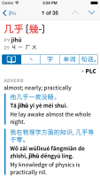
The bars next to the example sentences seem unnecessary; indentation does the job of setting them off from the definition. The bars also make the page look heavier than it needs to.
Yeah, those have been controversial with a lot of people - personally, I agree with you that they seem heavy but I like the fact that they tie each example's items together, and separate adjacent examples from each other, and that they pick up on the already very heavily used "quotation" format from many other websites / apps / etc (including Apple's own mail client).
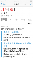
Here's an alternate version with the quote bars gray instead of blue - does that work any better for you? Makes them less heavy at least, though it also makes it less obvious that we're connecting the example to the Pinyin / definition below it. I'm worried that if we didn't use them at all we'd need some other separator between examples that would only make matters more confusing - we use horizontal lines in a bunch of other places as-is (between dictionaries and between specific definitions within dictionaries) so another horizontal line separator is going to start to make the hierarchy tough to follow.
