The layout is an improvement for when you're looking up dictionary entries, though maybe a *little* less white space would be better.
However, one area I find the new layout to be a problem is in the Flashcards. Often there is only enough space for the first 1 or 2 entries of a multi-definition word/character to be displayed (depending on the number of examples).
I'm specifically referring to when testing by showing the english definition, and then having to guess the chinese.
One idea to help with this might be to have an option in the Flashcards so that when you are being tested, you can set it to show "Defn Only" on the question screen, but when the answer is displayed, it switches to the "Show All" or "No Xrefs" mode.
Or, on the answer screen have a button to expand the card to see the full entry (assuming you've got it set to "Defn Only" in the settings).
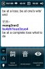
By the way, I have noticed that on a lot of flashcards, since the white-spacing update, the Pinyin is being shown in the examples (highlighted in blue), on the test/question screen. This only seems to happen with the PLC dictionary. (Again when doing English to Chinese testing).
Regards,
Ben