Pleco for Android 3.1 Beta 8

mikelove

皇帝
Staff member
Just 1 day turnaround for this one, since there were a couple of issues in beta 7 that were making the software semi-unusable for some people (mainly that Organize Cards crash on 4.1) and we didn't want anybody to be forced to revert to an earlier beta.

If you already have an earlier beta and you got it through Google Play, it should show up as an update within a few hours. Otherwise, you can get it:

a) Through Google Play. Sign up for our Android Beta Testing group at:

https://groups.google.com/forum/#!forum/pleco-android-beta-testing

And then sign up for beta versions of Pleco at:

https://play.google.com/apps/testing/com.pleco.chinesesystem

after which you should be able to get it right from them. (this isn't up yet but should be in a few hours)

b) Directly from our website; APK at:

http://cdn.pleco.com/androidapps/plecodroid-140606-310b8.apk

The Google Play version makes it easier for us to collect crash reports, so please use that one if you can.
 

mfcb

状元
in history (dict, maybe also others) long press 1st (newest) entry, select delete in popup, does not delete the newest entry but the next.
 

HW60

状元
Are there special rules for beta-testers with 2 Android devices? I found an update for Pleco from Google Play on my phone, installed it (from 2.4.18), and when I looked at my tablet later, I had to install again.
 

mikelove

皇帝
Staff member
No special rules, but could be some sort of glitch on Google Play I guess - did it work correctly on the second install?
 

HW60

状元
No problems afterwards. Maybe it happened because I installed the new HWR on my phone and am only allowed one?
 

mikelove

皇帝
Staff member
Update: we've now posted new versions of half a dozen previously bugged dictionary databases, so if you download those that should take care of a lot of issues including the annoying blank-lines-in-SENTS problem.
 
I downloaded the new ABC and Oxford dictionaries, and all blank entries are gone!
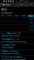
I do have a question about the Oxford sents display though. It has two lists of sentences while each other dictionary I have has one. Is this just because it is divided into Chin-Eng and Eng-Chin sections? Also can the list expansion text and arrow for each dictionary be put in the middle. If you have a big screen phone it's really hard to reach to the othe r side of the screen with a left thumb, if using one handed. This could be a middle ground between left and right handed people.
 

Attachments

  • Screenshot_2014-06-06-23-34-28.png
    Screenshot_2014-06-06-23-34-28.png
    85.2 KB · Views: 484

giokve

进士
The example sentences of words with only one definition in GF are rendered like this.
 

Attachments

  • Screenshot_2014-06-07-11-20-55.png
    Screenshot_2014-06-07-11-20-55.png
    174 KB · Views: 469

mikelove

皇帝
Staff member
@thefriendlygeek - great!

The duplicated abbreviations are indeed caused by the Oxford having two different sections, yes. (though we really ought to make it "OXC' and "OXE" or something like that)

With the arrows / buttons, how about if we just added a "left-handed mode" that put items on the left? Design-wise I think it works best to have them on the right (makes them more clearly distinct from text in definitions) and don't want to depart from that as the default, but we could offer an option to reverse it for users who don't mind the typographical confusion.

In general, though, if you find yourself expanding / collapsing dictionaries a lot then it might make more sense to play around with the options for different dictionary opening modes and/or for the dictionary swipe bar at the bottom of the screen - we didn't really design this with the expectation that people would be expanding / collapsing sections that often; if we had, we would have made the collapse buttons bigger and more obvious.

@giokve - thanks!
 

ckatt

状元
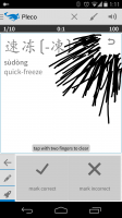
Maybe I'm remembering this wrong but didn't thee used to be an option to remove the undo button in the flashcard sketch box? I find it to be a little large, much bigger than the icon. I often start a stroke on its edge and thus it doesn't register. Also in landscape mode it is positioned at the bottom of the screen. I think it should be at the bottom in portrait mode as well.
Bottom right makes the most sense to me since you can draw on it if the stroke began outside the icon.
 

Attachments

  • Screenshot_2014-06-07-13-11-50.png
    Screenshot_2014-06-07-13-11-50.png
    178.5 KB · Views: 472

Taichi

榜眼
Cool, I can't find any more bugs! So some personal feedbacks.
- I prefer dict switching button of the flashcard test located on the left side so that I can use only the left hand for testing (other buttons are all on left side). Maybe can make the whole bar clickable, but could be weird.
- I want options to hide example translation and reference lines of the HDC (e.g.《红楼梦》第十九回) to save the vertical space.
 
@thefriendlygeek - great!

The duplicated abbreviations are indeed caused by the Oxford having two different sections, yes. (though we really ought to make it "OXC' and "OXE" or something like that)

With the arrows / buttons, how about if we just added a "left-handed mode" that put items on the left? Design-wise I think it works best to have them on the right (makes them more clearly distinct from text in definitions) and don't want to depart from that as the default, but we could offer an option to reverse it for users who don't mind the typographical confusion.

In general, though, if you find yourself expanding / collapsing dictionaries a lot then it might make more sense to play around with the options for different dictionary opening modes and/or for the dictionary swipe bar at the bottom of the screen - we didn't really design this with the expectation that people would be expanding / collapsing sections that often; if we had, we would have made the collapse buttons bigger and more obvious.
I think the OXC and OXE designation would be sufficient to prevent confusion.
If the left hand mode only affected the normally hard to reach GUI elements, then it would be welcomed.
I think the currently implemented dictionary priority setting will most likely give me the freedom I need to prioritize the example sentences that show first in the list.
Thanks again for this awesome software! Was at a baptism for a Chinese friend and made a recommendation to use your software.
The continuously reading text to speech mode for the reader mode is fantastically useful for slowly ramping up your listening speed, until you can understand at a normal rate.
 

jmu3

Member
  1. I noticed a difference in the way the currency for Add-on prices are displayed compared to Beta 6. In Beta 6, a 3 character currency code was displayed, but in Betas 7 & 8 the currency is shown simply as “$” (is that USD, CAD, … ?). I think the 3 character code is preferable as it avoids any ambiguity. (The price itself seems to be converted to local currency.)

  2. The menu button still isn’t working in the OCR module. The first time I press the menu button, nothing happens. The second time I press the menu button, the menu briefly appears and then instantly disappears.
 

mikelove

皇帝
Staff member
@ckatt - that one's dicey because for every person who thinks the button is too large there's somebody else who thinks it's too small. The top-right placement is because in portrait handwriting input, the lower right corner is also where the Done button is - you'd end up with a lot of really annoying accidental taps on Done.

@Taichi - "dictionary button on the right" is what we do pretty consistently everywhere else (definitions, popup reader, result lists, etc) so I'm reluctant to deviate from it in that one place; that screen's going to change a lot soon anyway when we overhaul flashcards.

With HDC, I understand hiding references but what do you mean by "example translation" lines?

@thefriendlygeek - done on OXC/OXE, check your "Updated" tab. And thanks!

@jmu3 - 1) relates to our switching to Google's new in-app purchase system; unlike the old system, the new one gives us the ability to fetch exact prices off of Google's server, so we can show people what they're actually going to pay in their local currency before they buy. There doesn't seem to be any support in that system for fetching the country code associated with the price, though, unfortunately - for the moment we think that the fact that they're mostly not X.99's or X.00's would be a tipoff for non-USD users.

2) I'm not sure about - works correctly here. What model of device are you using?
 

Taichi

榜眼
I mean english lines of example sentences from c=>e dictionaries. I often only cares chinese sentences, especially on the SENTS tab. GF block of SENTS is very skimmable compared to the rest for me as it's all Chinese chars. Btw, is HDC example sentences coming to SENTS tab?
 

mikelove

皇帝
Staff member
@Taichi - understood. And yes, HDC is still "experimental" at the moment - big dictionary with a lot more work to be done; should get a huge update later this year which cleans up Pinyin / characters et conversions, adds some rare characters, and adds all of the data from the recently published HDC "supplement" volume.
 

Taichi

榜眼
Odd, I cant't change the font size of flash test. Changing the card text->headword/definition size values has no effect.
 
Top