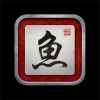
We're revamping the app icon to look a bit more "skeuomorphic" (realistically-textured, like most of Apple's new apps) - it'll still have the same 鱼 in the middle, but now it's against a paper background, with a little name seal in the corner, in a more proper frame - vaguely suggesting the idea of calligraphy. We were inspired to do this by the new Retina Display iPad - basically we feel like the current icon design just looks too "boring" on a device with such high resolution, which already the vast majority of our iPhone users are on (the iPhone 4 having been out for almost 2 years now) and soon enough the majority of our iPad users will be on too.
The current design looks like this:
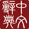
However, we're probably going to change the name seal part of it to something like this:
or to an old name seal from a calligraphic scroll, and we're also reconsidering whether the font for the middle character is the best bet - a few of the people we've talked to have suggested that it's either a) not very good calligraphy or b) unattractive-looking to people who don't know Chinese. (my wife describes it as a "frowny face" and on reflection I've come to realize that she has a point there - we don't want to look uninviting to people for whom characters haven't yet become familiar)
Anyone have any opinions about the icon in general or the font specifically? You can see 鱼 in a vast array of different fonts at this site (though to see the traditional version you have to enter the simplified 鱼 and then switch to traditional). We could also skip fonts altogether and just take a 鱼 from an old-enough-to-be-public-domain piece of calligraphy if it was high-resolution enough - there's a famous one that only has 3 strokes on the bottom, though that seems likely to elicit a lot of "hey, your icon is missing a stroke!" comments, but I haven't yet been able to dig up one by 王羲之 or 趙孟頫 or one of the other legendary calligraphers. (it would be extremely cool to have a design element on our icon from the Jin dynasty)
The current design looks like this:
However, we're probably going to change the name seal part of it to something like this:
or to an old name seal from a calligraphic scroll, and we're also reconsidering whether the font for the middle character is the best bet - a few of the people we've talked to have suggested that it's either a) not very good calligraphy or b) unattractive-looking to people who don't know Chinese. (my wife describes it as a "frowny face" and on reflection I've come to realize that she has a point there - we don't want to look uninviting to people for whom characters haven't yet become familiar)
Anyone have any opinions about the icon in general or the font specifically? You can see 鱼 in a vast array of different fonts at this site (though to see the traditional version you have to enter the simplified 鱼 and then switch to traditional). We could also skip fonts altogether and just take a 鱼 from an old-enough-to-be-public-domain piece of calligraphy if it was high-resolution enough - there's a famous one that only has 3 strokes on the bottom, though that seems likely to elicit a lot of "hey, your icon is missing a stroke!" comments, but I haven't yet been able to dig up one by 王羲之 or 趙孟頫 or one of the other legendary calligraphers. (it would be extremely cool to have a design element on our icon from the Jin dynasty)