Thanks!
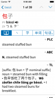
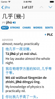
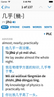
Actually I was talking only about the design of it, not the fact of having the bar at all - I'm pretty happy with that. The current Character Info screen is not very discoverable - this is useful information that we would like to make easier to find / get at. In fact I'd go so far as to say that for a lot of people the ability to access single characters from a multi-character word or compounds / stroke order from a single character is nearly as important as the ability to view the original dictionary entries.
And since it scrolls away along with the header (at the moment at least) I don't really view it as that big a burden space-wise - there are very few words for which that bit of space would make a difference, either it's rare enough that it only gets a one-sentence definition or it's common enough that it gets several pages of notes and examples to scroll through. We get very few complaints about this on Android in spite that the tabs are permanently at the top of the screen there.
Information-design-wise, it feels to me like this is a really logical way to do this because all of the information is related to the word in the header - here's the word that this page is going to tell you about, here are all of the things that it can tell you about it, pick one. A bar on the top (be it in the toolbar or scrolled out of the way) doesn't do that - it implies that everything below it will change if you tap on a different section. Likewise a bar on the bottom which at least on iOS implies that everything above it will change.
As for making it optional, we'll be happy to consider that if we get a lot of complaints about it in the finished app (wouldn't be difficult to make it hidden on top, as you suggest), or maybe even in the beta test, but we've got so many options already that I'm disinclined to add a new one to disable a feature that nobody outside of Pleco has even tried yet. But we certainly don't want to force people into a new UI they don't like.