Lijie said:
I really like the application. I've been using it since I got to Asia.
Thanks!
Lijie said:
When searching words, seems a bit laggy on my Galaxy Nexus.
Does this happen all the time or only in certain types of search? Do you notice the lag in the results coming up or in scrolling through them afterwords? Also, I notice you're using CFDICT - have you updated to the latest version of that via the "Updates" section in Add-ons?
Lijie said:
Could there be an option to turn off the "add to user dict" whenever you look up something that isn't in the dictionary?
That option only shows up if you've created a user dictionary and if that dictionary is unlocked / editable - if you "lock" your user dictionary via Settings / Dictionary / Manage Dicts, that will get it to disappear.
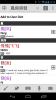
Lijie said:
Also in the image I uploaded, you can see the three dots on the top right that serve as the option menu. In the "old" Pleco version, it was on the bottom right where there's a little empty hole.
That one we didn't have much choice about - Google is phasing out that bottom-right button, in fact it's impossible to support it if you want your app to also properly take advantage of a number of newer Android UI features, and on some devices (e.g. the very popular HTC One X) that button is hidden / very hard to get to - we actually get quite a lot of support email from people who can't find it, not to mention all of the users who probably aren't even aware our app supports features like flashcards and a document reader because they've never thought to look for it. And we'd rather not put the button in the bottom toolbar since it would then have to confusingly "jump" to the top whenever the keyboard was open in order to remain accessible - we made that mistake with a different button in our iOS UI design and we've gotten a tremendous amount of flak about it.


")